Most marketers assume driving more traffic is the key to scaling revenue. They are wrong. Throwing money at ads to send traffic to a poorly optimised website is like pouring water into a leaky bucket; you must patch the holes before increasing the volume.
Key Takeaways
- Fix leaks first:Optimising your current user flow yields a higher ROI than doubling your ad budget.
- Data over opinion:Rely on heatmaps, session recordings, and A/B tests, not aesthetic preferences.
- Speed is revenue:Shaving 0.1 seconds off page load time can boost conversion rates by 8%.
- Localise for trust:Malaysian consumers require familiar payment gateways (FPX) and clear shipping terms.
What Is Website Conversion Rate Optimisation?
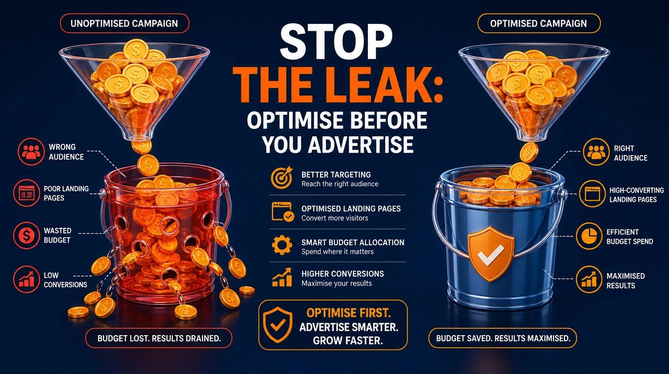
Website Conversion Rate Optimisation (CRO) is the systematic process of increasing the percentage of visitors who take a desired action on your site. Rather than relying on guesswork, CRO uses data analytics and user feedback to remove friction from the purchasing journey. To discover where your site stands, we recommend starting with a free website audit to establish a baseline.
Micro vs Macro Conversions
Conversions fall into two distinct categories. Macro conversions are primary business goals, such as completing a WooCommerce checkout or submitting a high-value B2B enquiry form. Micro conversions are smaller steps that indicate intent, like adding an item to a cart or watching a product video. Tracking both provides a complete picture of user behaviour.
Industry Conversion Rate Benchmarks
A baseline conversion rate depends entirely on your industry. E-commerce sites generally average between 1.5% and 3%. High-ticket B2B service sites might only convert at 0.5%, but the massive deal size justifies the lower volume.
Q: Does improving micro conversions guarantee more macro conversions?
A: Not necessarily. If a user downloads a guide but finds your checkout process confusing, they will still abandon the site. Micro conversions signal interest, but your bottom-of-funnel architecture must be flawless to capture revenue.
Why Does CRO Deliver Better ROI Than Ads?
Acquisition costs are rising globally. Platforms like Google Ads demand higher bids for the same audience. If your conversion rate is 1% and you spend MYR 10,000 to generate 100 sales, doubling your conversion rate to 2% gives you 200 sales for the exact same ad spend. Ignoring conversions is essentially accepting the hidden cost of cheap web development.
Quantifying Your Conversion Revenue Gap
Look at your average monthly traffic, current conversion rate, and Average Order Value (AOV). Calculate the revenue increase if your conversion rate improved by just 0.5%. That uncaptured money is your conversion gap.
Q: When should a business pause ad spend for CRO?
A: If your conversion rate sits below 1% and ad costs are rising, pause paid traffic. Fix the foundational layout and performance issues before buying more clicks.
The CRO Audit Phase
Before you change button colours or rewrite copy, you must diagnose exactly where users drop off. This initial research forms the basis of any data-driven website redesign strategy.
Essential Baseline Metrics
Identify the specific pages with the highest exit rates using Google Analytics 4 (GA4). If 80% of users leave at the checkout stage, optimising your homepage layout is a waste of resources.
Diagnostic Toolkit Recommendations
To understand why drop-offs happen, install qualitative tools. Heatmaps via Microsoft Clarity or Hotjar show where users click and scroll. Session recordings reveal real humans struggling with your navigation menus or broken form fields.
Why Do Core Web Vitals Impact Revenue?
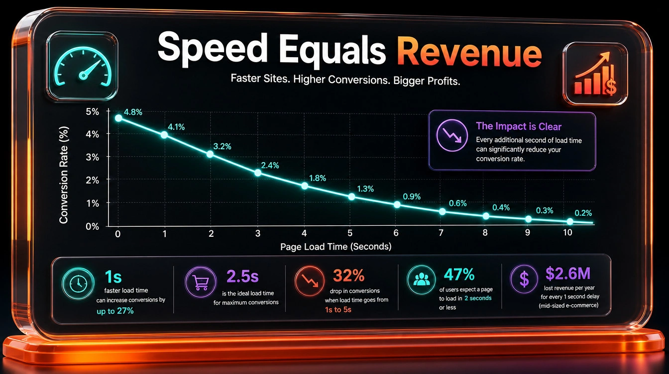
Speed is a direct conversion factor. Amazon famously found that every 100 milliseconds of latency cost them 1% in sales. We proved this locally: after completing extensive performance work and server management for a prominent Malaysian university, their site load times dropped from 5 seconds to under 2 seconds. This allowed the architecture to easily handle high peak enrolment traffic and measurably increased their student application conversion rate.
Q: How many users are needed for a reliable heatmap?
A: You need at least 1,000 pageviews per device type (desktop and mobile) to start seeing reliable click and scroll patterns without statistical noise.
The CRO Methodology
Successful companies treat CRO as a continuous scientific process. Booking.com runs thousands of A/B tests simultaneously. You do not need their volume, but you do need their discipline and a robust technical SEO architecture to run tests cleanly.
Step 1: Quantitative Analytics Data
Start with hard numbers. Which devices have the lowest conversion rates? Do users from specific traffic sources bounce immediately? Quantitative data highlights exactly where the problem exists.
Step 2: Qualitative Research Insights
Deploy exit-intent surveys. A single question asking “What prevented you from purchasing today?” often provides more actionable insight than guessing based on analytics alone.
Step 3: Hypothesis Formation
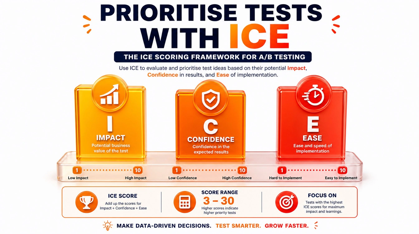
Prioritise your test ideas using the ICE scoring framework (Impact, Confidence, Ease). Focus first on changes that are easy to implement but have a high potential impact on revenue.
Step 4: A/B Testing Execution
Test your hypothesis by running a control version (original) against a variant (the new design). Split your traffic evenly between the two.
How Do You Ensure Statistical Significance?
Do not call a test a winner after three days. You must wait until the data reaches a 95% statistical significance level to ensure the result is not a coincidence.
Q: What is the biggest mistake in A/B testing?
A: Testing too many variables at once. If you change the headline, button colour, and image simultaneously, you will not know which specific change drove the result.
High-Impact Website Conversion Rate Optimisation Tactics
Aesthetic design cannot replace strategic layouts. This is why beautiful websites are broken for search engines and users alike.
Website Conversion Rate Optimisation Page Layouts
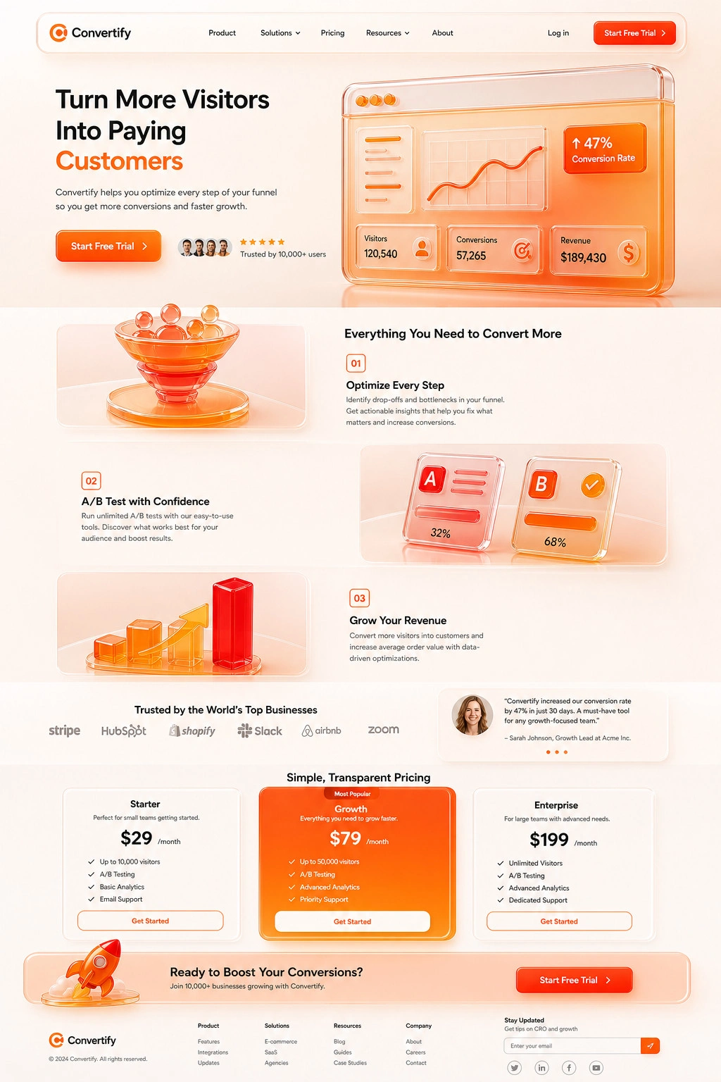
Visual hierarchy dictates where the user looks, reads, and clicks. If your page architecture ignores how human eyes naturally scan digital screens, even the most persuasive copywriting will fail to convert. To maximise performance, build your layouts around these proven structural rules:
- The Hero Section (Above the Fold): This is your most critical digital real estate. It must capture attention instantly. Include a clear headline focused on the customer’s ideal outcome, a sub-headline explaining the solution, and a high-contrast, action-oriented Call-to-Action (e.g., “Start Free Trial” instead of “Submit”). Place a trust signal, like a verified badge or short testimonial, directly next to the CTA to reduce hesitation.
- F-Pattern and Z-Pattern Content Flow: Design around natural reading habits. Use an F-Pattern for text-heavy pages, placing crucial text and CTAs along the top and left margins. For visual pages, deploy a Z-Pattern, placing your primary CTA at the bottom right of the diagonal scan path.
- Alternating Value Propositions: Use a zig-zag layout (image left/text right, then text left/image right) as users scroll. Focus on benefits over features by explaining exactly how the product improves the user’s life, supported by high-quality product mockups.
- Authority and Social Proof: Build immediate trust by placing real customer headshots, media logos, or specific adoption metrics (e.g., “Over 10,000 users trust us”) directly adjacent to your purchase options.
- Pricing and The Rule of Three: If you offer tiered pricing, present exactly three options. Highlight the middle tier with a contrasting background colour to reduce decision fatigue and naturally guide the user toward the most popular choice.
- Frictionless Single-Column Forms: For lead generation, ask only for essential information like Name and Email. Always use a single-column layout; multi-column forms cause visual friction and slow down completion rates.
- The Terminal CTA and Sticky Navigation: Do not force users to scroll back up after reading your pitch. Place a repeat CTA directly above the footer, or implement a sticky navigation bar to keep the primary action button visible throughout the scroll.
- Mobile-First Architecture: Over half of all web traffic is mobile. To execute true mobile-first web design, ensure CTA tap targets are at least 44×44 pixels for easy thumb pressing. Stack complex desktop grid layouts vertically, and compress code aggressively. Performance data shows that even a one-second delay in page load can drop conversions by 7%.
For deeper insights into layout testing, we highly recommend referencing heatmaps via tools like VWO or reviewing the extensive e-commerce usability guidelines published by the Baymard Institute.
Q: Should I use a sliding image carousel at the top of my layout?
A: No. Conversion data consistently shows carousels suffer from banner blindness, with click-through rates usually sitting below 1%. Use a single static hero section.
E-Commerce Product Detail Pages
In Malaysia, consumer expectations are conditioned by marketplace giants like Shopee and Lazada. If your standalone site breaks these visual patterns, you introduce friction. Pin your “Add to Cart” button to the bottom edge of the viewport on mobile devices. Place shipping estimates (e.g., “Ships via J&T Express within 2 days”) directly beneath the price tag.
How Do You Structure a Complete B2B Website for Lead Generation?
When executing a full website redesign for a B2B business, your goal is guiding users smoothly across the entire digital footprint. Unlike an aggressive standalone landing page, a complete corporate website must retain clear global navigation so buyers can naturally transition to your ‘About Us’ and ‘Services’ pages to evaluate your credibility.
This holistic approach yields massive results. For example, before revamping a major Malaysian GLC financial institution’s website, we conducted a rigorous pre-redesign SEO audit to diagnose exact drop-off points.
During the revamp, we completely restructured the website for better Semantic SEO, ensuring search engines could map the topical relationships between their financial services. We actively rewrote the content to address user search intent directly, paired with deliberate page structuring for conversion. By maintaining an intuitive global navigation menu and deploying simple, highly focused lead capture forms, we directly improved their CRO and increased total lead capture by 330% in 3 months.
| Layout Element | E-Commerce Product Page | Complete B2B Website |
| Primary CTA Placement | Sticky mobile bottom, right column on desktop. | Featured prominently in the global header and mapped naturally at the end of content blocks. |
| Navigation Menus | Essential (Breadcrumbs for related items). | Retained and streamlined (Enables corporate buyers to conduct due diligence). |
| Trust Signals Focus | User-generated photos and verified buyer reviews. | High-authority client logos, case study metrics, and clear data security policies. |
Are Your WordPress Core Settings Killing Conversions?
For businesses running on WordPress, backend configuration dictates user experience.
Essential Plugin Stack for CRO
Limit your active plugins. A bloated backend slows down TTFB (Time to First Byte). Keep only essentials like FlyingPress for caching and lightweight form builders for lead capture.
WooCommerce Checkout Optimisation
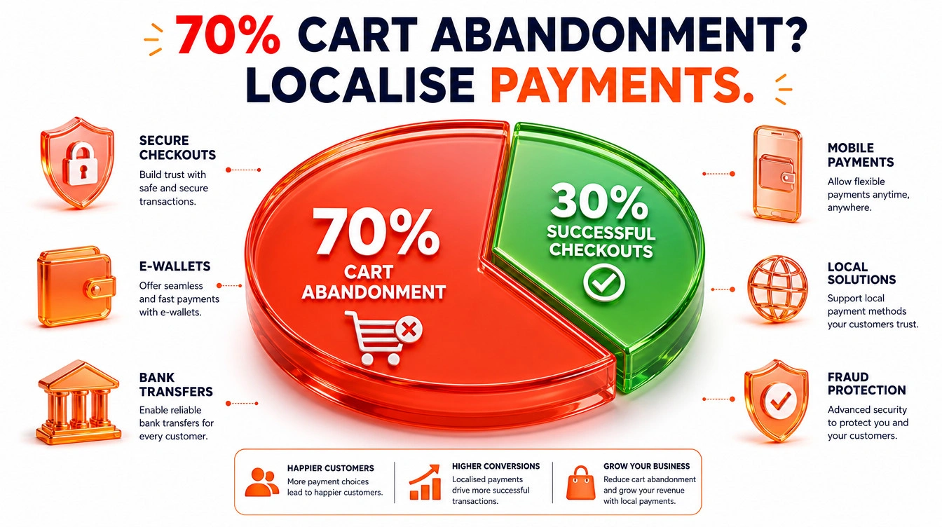
According to checkout usability research by the Baymard Institute, the average cart abandonment rate is over 70%. In Malaysia, a significant portion happens when users cannot find familiar options. You must integrate FPX (via Stripe or Billplz) and local e-wallets like Touch ‘n Go.
Q: Does local hosting improve Malaysian conversion rates?
A: Yes. Hosting your site locally with providers like Exabytes / ServerFreak or using a regional CDN node in Singapore reduces latency. This directly aids conversions by improving speed optimisation metrics.
What Are the Critical CRO Mistakes?
The most common failure is making design and copy changes based on opinion rather than user research data. Ensure you have proper custom web development support to code tests correctly without breaking the site layout.
Q: Is copying my competitor’s layout a valid CRO strategy?
A: No. Your competitor might have terrible conversion rates. You are blindly copying their mistakes instead of testing what works for your specific audience.
Measuring CRO Success
You must track conversions against hard revenue, not just click metrics.
How Do You Communicate ROI to the Board?
Do not talk about bounce rates to the C-Suite. Talk about Customer Acquisition Cost (CAC) reduction and total recovered revenue from abandoned carts. This clearly justifies investments like your ongoing website maintenance cost in Malaysia.
Q: How often should we report on CRO metrics?
A: Monthly reporting is standard. It provides enough time for traffic to accumulate and statistical significance to build for most split tests.
Frequently Asked Questions
Next Steps
- Install a heatmap tool today: Add Microsoft Clarity (it is free) to your highest-traffic pages to immediately spot where users are getting stuck.
- Audit your mobile checkout: Attempt to buy your own product using a smartphone on a 4G connection. Document every piece of friction.
- Calculate your baseline: Open GA4, pull your current conversion rate and AOV, and calculate exactly how much revenue you are losing to cart abandonment.
Ready to stop leaking revenue? Request a comprehensive technical audit of your site architecture to identify your biggest conversion bottlenecks.